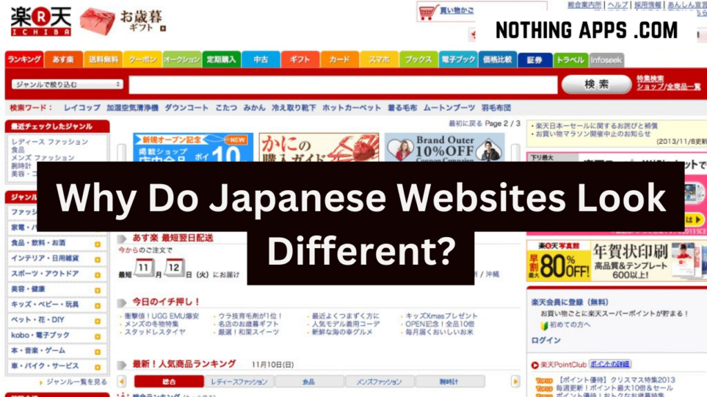
Why do Japanese websites look different?

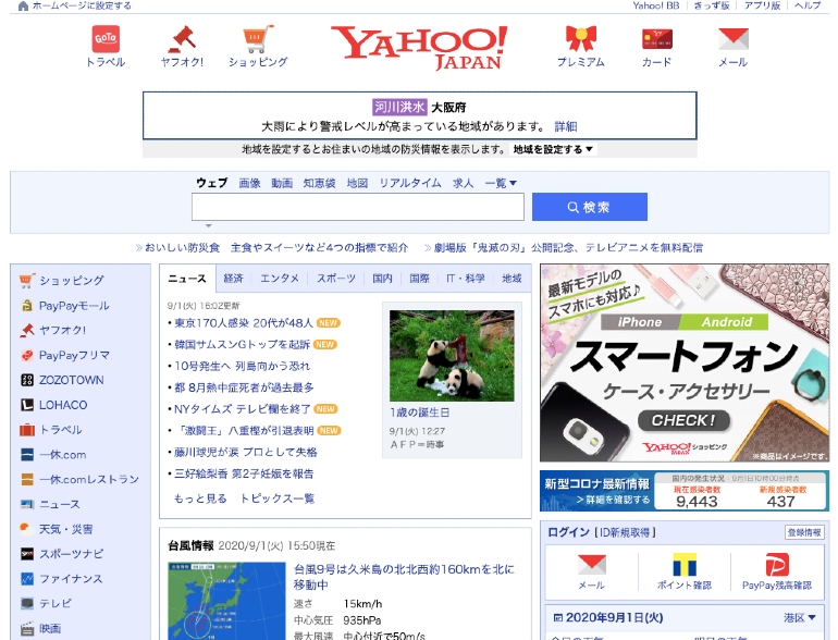
The internet is a vast and ever-evolving space, and each corner of the digital world seems to have its own unique characteristics. One intriguing aspect is the distinct design of Japanese websites, often described as “colorful and a little cramped” in comparison to the sleek minimalism found in many other regions. In this blog, we’ll unravel the mystery behind the unconventional appearance of Japanese websites, exploring the language, culture, and technological factors that contribute to their distinctive style.
In a world dominated by minimalist designs and large clean images, Japanese websites stand out as vibrant and visually busy. The popular belief is that this unique design reflects the language and culture of Japan. However, the accuracy of this theory is put into question in a journey through the intricacies of web design.

Characters, Culture, and Technology
The initial theory suggests that the use of Chinese, Japanese, and Korean logographic characters, collectively known as CJK characters, influences the design of Japanese websites. The immense number of characters and the resulting large font file sizes may limit font options, slow down loading times, and impact design choices. However, an investigation reveals that other regions using CJK characters don’t necessarily exhibit the same design patterns.

Culture is then explored as a potential factor. Geographic proximity and categorization into global north or global south do not yield patterns that align with Japan’s web design. This leads to the conclusion that culture might not be the primary influencer.
Finally, the focus shifts to technology and how hardware and software have shaped the evolution of web design. The rise of smartphones, in particular, plays a crucial role. The Japanese smartphone revolution, a decade ahead of the rest of the world, meant that Japanese websites didn’t need to adopt the practices of mobile-friendly design when the Western web began simplifying for the iPhone. Domestic companies were already profitable within Japan, leading to a lack of motivation to spread abroad.

Conclusion
The blog concludes that the unconventional appearance of Japanese websites is primarily attributed to their unique relationship with technology. The Japanese internet, rooted in outdated technology, stands as an artifact shaping the way information is consumed. This revelation prompts a reflection on how the medium itself influences the message, with implications for how we perceive and interact with the digital world.
Relevance Beyond Japan
The significance of this exploration extends beyond Japanese websites. It prompts consideration of how the infrastructure of the internet tangibly shapes our consumption of information. As web technologies continue to evolve, the way we experience and interpret online content is influenced by the medium itself. The blog encourages readers to reflect on their own interactions with the internet and the impact of evolving technologies on their digital experiences.
In essence, the aesthetics of Japanese websites serve as a captivating entry point into the broader conversation about the interplay between technology, culture, and design in the ever-evolving landscape of the internet.


